Improving the User Experience of Date Pickers with Ember.js
22 Jan 2015The Problem with Date Pickers
I have mixed feelings about date pickers. On one hand they look nice, but depending on the use case, the experience can be less than ideal.
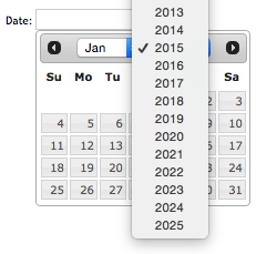
They are perfect if you need to see the date in the context of the surrounding days, such as when renting a hotel room or buying airline tickets. However, like a wall calendar, they are not optimized for viewing or selecting dates outside the current month. They typically default to today's date and choosing anything else becomes a game of "how many clicks does it take?".
A few of us at Agilion are building an Ember.js web application for a customer which allows parents to privately share their kids' photos, videos, and more with family and close friends. One of the first experiences users have with the app is an onboarding process where they enter information about their kids.
We recently ran into a UX issue where the date picker for selecting a kid's date of birth was a calendar, and we wanted something that was easier to use. In the case of a birth date, the surrounding context does not matter, so we were not limited to using a calendar-style date picker.
When someone asks for your date of birth, how do you say it? If you're like me, you say the month number, followed by the day, followed by the year. I don't picture a digital wall calendar where I have to select the year, then select the month and finally the day.
Wouldn't it be nice if we could enter dates in a more natural way? It turns out we can!
Hello Input Masks
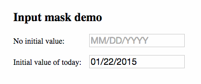
An input mask solves this UX problem by natually guiding users as they enter a value or set of values into a form field.
For this project, we chose jquery.inputmask for its flexibility and extensive documentation. Out of the box it supports dates, currency, phone numbers, email addresses, and many others.
Building an Ember.js Input Mask Component
To create a form input field as demonstrated above, we'll need to do the following:
- Install jquery.inputmask and Moment.js
- Create an input-mask component
- Insert the component into our template
The source of the demo app shown above can be found here. Note that this demo was built with ember-cli 0.1.2, but should be compatible with newer versions.
1. Installing the Dependencies
To get started, we'll need to import some dependencies. First lets install the latest version of jquery.inputmask using bower:
$ bower install jquery.inputmask --save
We'll also include Moment.js to handle date parsing and displaying:
$ bower install moment --save
Then we just need to import the two dependencies into our Brocfile:
Brocfile.js
app.import('bower_components/moment/moment.js');
app.import('bower_components/jquery.inputmask/dist/jquery.inputmask.bundle.js');
2. Creating the Component
Then we need to generate a component called input-mask:
$ ember g component input-mask
Inside the component, we'll initialize the input mask on the component's
DOM element. Note that the component inherits from Ember.TextField.
This provides us with the default behavior of Ember's built-in text field.
app/components/input-mask.js
/* global moment */
import Ember from 'ember';

export default Ember.TextField.extend({
  initializeMask: function() {
    var mask = this.get('mask');

    this.$().inputmask(mask, {
      onBeforeMask: function(value) {
        if (mask === 'mm/dd/yyyy') {
          return moment(new Date(value)).format('L');
        }
      }
    });

    // The input mask changes the value of the input from the original to a
    // formatted version. We need to manually send that change back to the
    // controller.
    this.set('value', this.$().val());
  }.on('didInsertElement')
});
The last part - this.set('value', this.$().val()); - was added in our app to be compatible with ember-validations. It may not be required, but it's there if you need it.
3. Using the Component
In our template, we simply insert the component like so, providing the 'mask' and optional placeholder:
{{input-mask
  mask='mm/dd/yyyy'
  placeholder='MM/DD/YYYY'}}

{{input-mask
  value=bornOn
  mask='mm/dd/yyyy'
  placeholder='MM/DD/YYYY'}}
In both cases, we are passing a mask property of 'mm/dd/yyyy' to the component. This is one of the mask types provided out of the box. Since our value is coming in as a JavaScript date object, we need to transform the value before the mask can use it:
this.$().inputmask(mask, {
  onBeforeMask: function(value) {
    if (mask === 'mm/dd/yyyy') {
      return moment(new Date(value)).format('L');
    }
  }
});
Here we are converting the date object that is passed to a string using Moment's 'L' format. This converts the date to the string format that the input mask is expecting: 'mm/dd/yyyy'. It needs to happen in onBeforeMask because we have to preprocess the value before the mask is applied.
Conclusion
By introducing input masks into our forms, we have optimized for the majority case. It doesn't matter if your kid's birthday was yesterday or five years ago because the UX is the same for everyone.
This post has barely scratched the surface of what can be done with input masks. The documentation is thorough, albeit slightly intimidating. I'd recommend checking out the demo page for ideas on other ways to use it in your app.
Thanks for reading!
comments powered by Disqus